When watching Grand Designs recently, Kevin McCloud was talking about the usability of a staircase. It’s a sad and/or strange admission, but this caught my attention; Usability should be considered with physical objects, not just websites.
My heating system is an object, it’s inactive, but I interact with it and form a relationship with it. Whether it’s love or hate, it’s a relationship. The more positive a relationship I have, the more likely I am to interact with it without even thinking about it. I’m more likely to go back to it. How do I have a positive relationship with it? If it’s easy for me to use.
I’m pretty sure anyone reading this has had some kind of negative experience when trying to use a physical object. If not, where are you living?
It’s the same with paper. Have you ever opened a letter and not understood what it’s asking you to do? Have you sat puzzling over a form, not sure what the questions are asking, or which bits you should fill in. Have you managed to get confused when trying match up the instructions and the materials provided with flat-packed furniture?
The natural reaction as human beings is to start to question ourselves – is it me? Did I read the instructions properly? What am I doing wrong?
Past projects have seen us working with heating systems, mobile phones, remote controls, child car seats, ballot papers as well as websites. None of us here are technicians, electricians, designers or political experts, but we watch people, study their behavior, and see when they are struggling to understand how to complete the task in hand. We make recommendations on ‘how to make it easy’ based on what we see, and our experience and knowledge.
So whether it’s a website or any physical object, make your users happy and have positive relationships & experiences with your products. How? By making it easy to use!
Friday, 20 February 2009
Wednesday, 11 February 2009
Opting out of marketing programs
I was recently looking at comparison websites, and was amazed at how they get potential customers to overlook the ability to opt-out of marketing programmes.
Money Supermarket had a pre-checked check box as default on their form which I then had to un-check to opt-out.
The pre-checked check box certainly isn’t ideal, but it’s better than hiding options.
In order to opt out of Compare the Market’s marketing material, the opt-out area is located in the Terms &Condition’s (T&C). Who reads the T&C? When I accessed the T&C’s, I had to then tick the box to opt-out as the default was to receive information.
Go Compare dealt with this in a very interesting way that I’d not seen before. This time, instead of the check box, it said ‘If you'd prefer not to use this service, please click here’, so there was no check box visible on the page - See image below:

Aside from the fact the link text said 'please click here', once you clicked the link, the section revealed a previously hidden extension with a checkbox for me to tick if I wanted to opt-out of receiving marketing material. Only if you spot the textual link, read the small print, click on it, do you then get the option to opt-out – it’s pre-set for you to receive marketing information.

Surely these examples have the opposite effect that the company wants to happen. Customers will sign up unknowingly, and as a result receive calls/emails from insurance companies. Customers often use websites and in particular comparison sites because they want self service quotes and avoid inconvenient phone calls. Disguising privacy options and opting customers into sharing their details automatically with others will have a damaging impact on the relationship between the company and customer.
Evidence presented here clearly shows that best practices are required whenever customers provide personal information:
Money Supermarket had a pre-checked check box as default on their form which I then had to un-check to opt-out.
The pre-checked check box certainly isn’t ideal, but it’s better than hiding options.
In order to opt out of Compare the Market’s marketing material, the opt-out area is located in the Terms &Condition’s (T&C). Who reads the T&C? When I accessed the T&C’s, I had to then tick the box to opt-out as the default was to receive information.
Go Compare dealt with this in a very interesting way that I’d not seen before. This time, instead of the check box, it said ‘If you'd prefer not to use this service, please click here’, so there was no check box visible on the page - See image below:

Aside from the fact the link text said 'please click here', once you clicked the link, the section revealed a previously hidden extension with a checkbox for me to tick if I wanted to opt-out of receiving marketing material. Only if you spot the textual link, read the small print, click on it, do you then get the option to opt-out – it’s pre-set for you to receive marketing information.

Surely these examples have the opposite effect that the company wants to happen. Customers will sign up unknowingly, and as a result receive calls/emails from insurance companies. Customers often use websites and in particular comparison sites because they want self service quotes and avoid inconvenient phone calls. Disguising privacy options and opting customers into sharing their details automatically with others will have a damaging impact on the relationship between the company and customer.
Evidence presented here clearly shows that best practices are required whenever customers provide personal information:
- Don’t have the check box pre-checked. Allow customers to opt-in rather than opt-out.
- Don’t hide the check box in the T&C’s.
- Display the check box to opt out initially, that’s what customers will scan for.
- If the page refreshes due to an error, make sure once the customer has chosen to opt-in or out, their choice remains fixed: they should not have to input their choice again.
Sunday, 1 February 2009
Good Vibrations via my mobile
For the past week I have been in that rapture of getting a new phone and enjoying all the new features and improvements from my previous one. After a long flirtation with the iPhone, I finally committed myself to the HTC Touch HD, and I have no regrets.
I have actually been using the HTC products for my past 3 phones, although branded as the Orange SPV range, before HTC had the brand confidence to lose the alias. Among the many features (like the iPhone, it lets you flick things around the display, and also has great photo image quality and connection speeds) one of my favourite is not something I see or hear but rather feel.
The HTC Touch is the first phone I have that uses vibrations for more than letting me know when calls or messages are incoming when I am in a movie or meeting where a ring would be a nuisance. The phone uses haptic feedback via a short vibration or bump to let me know when little things have happened such as:
Its a tiny feature but I am surprised at how much it adds to my overall experience and enjoyment of the phone.
I recall doing some experiments in haptics, the sense of touch and psychophysics way back in my university days but this is the first product I have had that has elegantly integrated it into the usage (aside from the Wii on the gaming front). Thinking back to my previous phone I realise that often when I made a call I had to alternate between holding the phone to my ear and looking at the display to see if it had been answered, particularly in a noisy environment like a gig or a bar. A minor issue in the grand scheme of things, but still one that is better off solved through a gentle vibration.
No doubt haptics will be integrated into more things and, used wisely, should be a positive contribution to mobile phone and consumer product usability. I certainly am looking forward to it as products make best use of all of our senses.
I have actually been using the HTC products for my past 3 phones, although branded as the Orange SPV range, before HTC had the brand confidence to lose the alias. Among the many features (like the iPhone, it lets you flick things around the display, and also has great photo image quality and connection speeds) one of my favourite is not something I see or hear but rather feel.
The HTC Touch is the first phone I have that uses vibrations for more than letting me know when calls or messages are incoming when I am in a movie or meeting where a ring would be a nuisance. The phone uses haptic feedback via a short vibration or bump to let me know when little things have happened such as:
- my call has been answered
- moving to a new web page
- closing an application
- the little ball in the 'Teeter' game is bumping into a wall (see video of it being demonstrated on the HTC Diamond)
Its a tiny feature but I am surprised at how much it adds to my overall experience and enjoyment of the phone.
I recall doing some experiments in haptics, the sense of touch and psychophysics way back in my university days but this is the first product I have had that has elegantly integrated it into the usage (aside from the Wii on the gaming front). Thinking back to my previous phone I realise that often when I made a call I had to alternate between holding the phone to my ear and looking at the display to see if it had been answered, particularly in a noisy environment like a gig or a bar. A minor issue in the grand scheme of things, but still one that is better off solved through a gentle vibration.
No doubt haptics will be integrated into more things and, used wisely, should be a positive contribution to mobile phone and consumer product usability. I certainly am looking forward to it as products make best use of all of our senses.
Labels:
haptic technology,
iphone,
Mobile phone usability
Communicating across web accessibility barriers
Recently I had the opportunity to communicate across several barriers and technologies in a fascinating demonstration of how people and technology can be combined to overcome accessibility challenges.
After speaking at the Andicom Conference in Cartegena Colombia, I attended the commercial exhibition and particularly the U-city, a demonstration of ubiquitous computing in various areas of everyday life.
As User Vision provide many web accessibility services such as usability testing with disabled users and accessibility audits, I spent quite a bit of time with the project Conectando Sentidos (Connecting Senses) the Colombian Ministry of Communication’s programme addressing accessibility in technology.
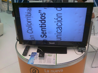
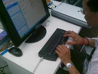
There, in addition to seeing their demonstrations of magnifiers and refreshable Braille displays (photos below), I met for the first time a person who was both deaf and blind. I have long wondered how people without either hearing or sight can communicate, especially using today’s technologies.
The team set about demonstrating by having me engage in a conversation across several potential barriers, as shown in the photos: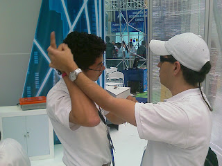
After speaking at the Andicom Conference in Cartegena Colombia, I attended the commercial exhibition and particularly the U-city, a demonstration of ubiquitous computing in various areas of everyday life.
As User Vision provide many web accessibility services such as usability testing with disabled users and accessibility audits, I spent quite a bit of time with the project Conectando Sentidos (Connecting Senses) the Colombian Ministry of Communication’s programme addressing accessibility in technology.
There, in addition to seeing their demonstrations of magnifiers and refreshable Braille displays (photos below), I met for the first time a person who was both deaf and blind. I have long wondered how people without either hearing or sight can communicate, especially using today’s technologies.


The team set about demonstrating by having me engage in a conversation across several potential barriers, as shown in the photos:

- What I said in English was first translated to Spanish by one team member
- Another person communicated the message to Juan, the deaf & blind person by holding their hands & arms and manoeuvring them in a way to convey the message in a form of physical sign language
- Once he understood the message Juan used sign language to communicate to another person via a web cam and web connection
- The person at the other end of the web cam replied, their response was translated by movement again to Juan, and the process continued.
The demonstration was a fascinating display of overcoming barriers through innovation and technology, and for me a great insight to how communication is achieved with people who are both deaf and blind.
Subscribe to:
Comments (Atom)

