Friday, 1 May 2009
A new home
The User Vision blog has now moved to http://www.uservisionblog.co.uk. Please update your bookmarks and we look forward to welcoming you there.
Friday, 3 April 2009
Primed For Success
 Firstly, I would like to say that I have had a long and almost always successful relationship with Amazon. However, we are all used to ‘hidden’ costs associated with too good to be true deals. This is part of the everyday online purchase process and something which is becoming more and more prevalent. After a recent £30+ purchase, imagine my delight at being offered Free ‘Prime’ delivery on future purchases: ‘Congratulations you have qualified for our Free Amazon Prime™ service’. Hold me back!
 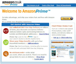 Although this might be one of those ‘too good to be true’ offers, I trusted Amazon and duly ordered a CD with prime delivery. Unfortunately, the postcode coverage did not extend to my location within the Scottish central belt so it was not possible to take advantage of this service. Six weeks later my account showed that I had been charged £47.97 for my annual Prime membership. My confusion was two-fold, why has this happened and also why does the site show 2 different annual fees?
 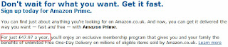 To ensure a balanced discussion Amazon did refund the £47.97 within 2 working days thanks to a helpful CSR I spoke to on the telephone. They also sent an email in advance of the refund to reassure me that the refund would happen. This is potentially a very useful service to serial Amazon users (which is also extended to family members) living in, what is defined as, accessible parts of the UK. However, providing this information upfront with clearly specified customer benefits and a consistent price point would assist in the uptake of this service. It would also ensure that customer satisfaction is not compromised.
Tuesday, 31 March 2009
Testing the online census with users proves useful
Last year I blogged about the announcement that The General Register Office is planning to provide an online version of the 2011 census. In the blog I stressed the importance of testing the form to ensure that nothing prevents participants from completing it successfully. So when I received a leaflet stating that our household would be taking part in a 'trial run' I was very pleased. A few days later I was presented with my own census form. Sunday the 29th March (or thereafter) was the day everyone was being instructed to complete and return the form.
As the online version was something which appealed to me I was excited to get the opportunity to help test it out. I can report that on the whole my experience was a positive one. After entering your personal census code into the site, you are immediately taken to the form. Sections are separated onto a different pages with clear navigation buttons back and forth. The number of questions to each page is always minimal which saves scrolling. Clear instructions are also provided at necessary points.
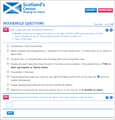 If the instructions are not sufficient, help is provided in a question mark button next to each question. Although this is good practice, the button did not behave in a way I expected. When you select a button the page refreshes and takes you back to the top of the page. This is confusing and frustrating. Additionally, the help appears between the question and the field to answer (see image below). Normally when such a button is used a pop-up box opens or some text appears near the question without refreshing the page. As a result, my previous answer to another question was cleared so that when I tried to proceed, an error was returned. Although the error reporting was clear, it seemed unnecessary to clear previous answers and caused some annoyance.
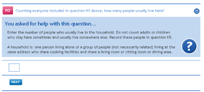 Another thing that was missing was a progress bar. Completing a census is quite a long process with lots of questions. At one point when my enthusiasm was beginning to wean, I searched for a progress bar to provide me with some encouragement. In this situation it would have been really useful to have some idea how far I was through the form and how much longer it might take.
Lastly, I was disappointed to find how much paper was wasted sending me a physical copy of the census when I knew I would complete it online. The paper census form cannot be reused by anyone else and must therefore be recycled. It seems that there could be a better system which would save the expense of creating surplus paper versions. Currently those who want to vote by post can do so by opting into this system. Perhaps a similar system could be adopted here whereby those who want to participate online do so by writing/calling or emailing the relevant person. Receiving a short code requires much less, if any paper.
Overall, it is great to see that the Government wants to get this right in advance of the real event. I hope the feedback which I was able to provide at the end of the form will go some way to ensuring any small issues are resolved. I know that the exercise will prove very valuable.
Monday, 23 March 2009
Amazon - supporting the user experience post sales
What started off as a really useful tool for both Amazon and their customers, has in my opinion, turned into a user experience nightmare. I am talking about the overwhleming array of options presented once you select a product - customer reviews, ratings, tags, what other people bought, frequently bought together, sponsored links, etc - and somewhere amongst it all are the product details.
As part of my new years health kick (already going badly) I decided to look into buying a juicer. Having honed it down to one product, I found the technical details were unhelpfully separated from the product details and then again from the product description, casuing much scrolling and hunting around the page for the info I needed. All the cross selling information totally disrupts the user journey and causes inefficient navigation which I don't find helps me. It has the opposite effect of getting in the way and annoying me. Ratings/feedback from other customers are helpful, but splitting up important information that I need upfront creates a disjointed experience which puts me off purchasing.

However, today I am pleased to find that Amazon have employed a useful means of cross selling and overcoming the current complexity of their site. I received an email around 3 weeks after I made a purchase from them, which provided a simple digest of other accessories I may find useful to add onto my purchase. Given I've had a few weeks to get used to the product, the timing works well. It also cuts through all the different presentation styles for ranking and rating accessories, and just gives me the information straight.
If only Amazon could apply the same approach to their online store and simplify the user experience keeping things straightforward and uncluttered. Maybe I would buy that juicer and finally start my long overdue health drive!
Tuesday, 10 March 2009
5 Features of a Public Sector Feedback System
The Government today unveiled new measures to bring greater transparency to public services. As reported on the BBC news today, a new NHS website will allow patients to comment on their local services and rate their GPs, similar to e-commerce sites such as Amazon and eBay. Providing transparency to local services such as these will be welcomed by those people who use the services. However, it also raises questions of how such as system might be implemented to make it easy to use and ensure it provides value to the public. After looking at the systems used by retailers I've created a list below which outlines features that can be incorporated into a similar system for public sector websites.
- Ensure that users can locate the review form quickly and easily. In e-commerce sites, invites to review products are placed next to the product details page. For public services this could happen next to the GPs name, for example. Calls to action should be clear with links which stand out from other text.
- Provide a rating system which visitors can review at a glance. Amazon has been using a 5 star rating which has quickly become standard across many other e-commerce sites. Although this system can be somewhat crude, when used in association with a full review it can provide visitors with an overview of these comments, a rating breakdown and statistical averages. This makes it easier for users to identify the review they wish to read in detail which is often a problem when there are a large number to navigate through.

- Do not ask visitors to register to leave a comment. This can actively discourage users to leave feedback. If the information they might have provided would have been valuable to someone else then this is an issue. Typically feedback forms ask users to leave a "name" and an email address which is not published. As anonymity is important to some people, especially if the feedback is contentious, users should feel confident about leaving a comment. It also reassures users that their personal details will not be used for marketing purposes.
- Provide guidelines to those thinking of leaving feedback. This can avoid situations where comments are removed because they are abusive or include personal details. As well as outlining what users should not do, it can also be a good opportunity to suggest what users can write. Debenhams have provided a link to their customer service department for those who have serious or complicated complaints which may be better dealt with privately. This prevents negative messages from being left prematurely and shows customers that they are serious about customer service and satisfaction.

- Welcome bad reviews as well as good reviews. Although there may be a fear that negative reviews can attract bad publicity and discourage public use of certain services, ultimately allowing negative reviews will increase user confidence in the system. As the Government's goal is to increase transparency, censoring negative reviews would defeat the purpose of such a system and in the long term reviews would be used less and lose value. If users adhere to the guidelines outlined in point four, there should be no need to remove reviews unnecessarily.


Monday, 2 March 2009
Compulsory field indicators?
After having vented my frustration about opting out of marketing programs on a previous blog, I couldn't let my recent discovery pass without commenting.
On an online form, the most common practice for a required field is to use an asterix (*). This lets us know which fields are compulsory to complete. People are now familiar with this.
I recently recieved a feedback form from Crystal Ski holidays. On this, they have an asterix (*) next to various fields. Going by common practice, I would have thought, without looking at the key, that these fields are compulsory.
But no! The key (which is at the bottom of the form rather than the top) states '*Please provide if you agree to be contacted for marketing and research by us and other selected third parties.' See image below...

By completing what I thought were compulsory fields, I would have signed up to their marketing program, which is certainly not my intention.
So...
- Allow customers to opt-in rather than opt-out of marketing programs.
- Follow existing convention and to not try to trick the customer.
- Don't use people’s familiarity of required field indicators to get them to sign up for email marketing without realising it.
- Always put the text describing the indicator at the top of the fields. It is a piece of information the user needs to know before completing the forms, not after they think they’ve finished their task.
Friday, 20 February 2009
Grand Usability Designs
When watching Grand Designs recently, Kevin McCloud was talking about the usability of a staircase. It’s a sad and/or strange admission, but this caught my attention; Usability should be considered with physical objects, not just websites.
My heating system is an object, it’s inactive, but I interact with it and form a relationship with it. Whether it’s love or hate, it’s a relationship. The more positive a relationship I have, the more likely I am to interact with it without even thinking about it. I’m more likely to go back to it. How do I have a positive relationship with it? If it’s easy for me to use.
I’m pretty sure anyone reading this has had some kind of negative experience when trying to use a physical object. If not, where are you living?
It’s the same with paper. Have you ever opened a letter and not understood what it’s asking you to do? Have you sat puzzling over a form, not sure what the questions are asking, or which bits you should fill in. Have you managed to get confused when trying match up the instructions and the materials provided with flat-packed furniture?
The natural reaction as human beings is to start to question ourselves – is it me? Did I read the instructions properly? What am I doing wrong?
Past projects have seen us working with heating systems, mobile phones, remote controls, child car seats, ballot papers as well as websites. None of us here are technicians, electricians, designers or political experts, but we watch people, study their behavior, and see when they are struggling to understand how to complete the task in hand. We make recommendations on ‘how to make it easy’ based on what we see, and our experience and knowledge.
So whether it’s a website or any physical object, make your users happy and have positive relationships & experiences with your products. How? By making it easy to use!
Subscribe to:
Posts (Atom)