What started off as a really useful tool for both Amazon and their customers, has in my opinion, turned into a user experience nightmare. I am talking about the overwhleming array of options presented once you select a product - customer reviews, ratings, tags, what other people bought, frequently bought together, sponsored links, etc - and somewhere amongst it all are the product details.
As part of my new years health kick (already going badly) I decided to look into buying a juicer. Having honed it down to one product, I found the technical details were unhelpfully separated from the product details and then again from the product description, casuing much scrolling and hunting around the page for the info I needed. All the cross selling information totally disrupts the user journey and causes inefficient navigation which I don't find helps me. It has the opposite effect of getting in the way and annoying me. Ratings/feedback from other customers are helpful, but splitting up important information that I need upfront creates a disjointed experience which puts me off purchasing.

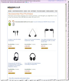
However, today I am pleased to find that Amazon have employed a useful means of cross selling and overcoming the current complexity of their site. I received an email around 3 weeks after I made a purchase from them, which provided a simple digest of other accessories I may find useful to add onto my purchase. Given I've had a few weeks to get used to the product, the timing works well. It also cuts through all the different presentation styles for ranking and rating accessories, and just gives me the information straight.
If only Amazon could apply the same approach to their online store and simplify the user experience keeping things straightforward and uncluttered. Maybe I would buy that juicer and finally start my long overdue health drive!
No comments:
Post a Comment