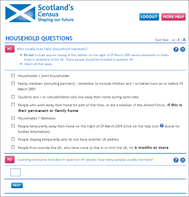
As the online version was something which appealed to me I was excited to get the opportunity to help test it out. I can report that on the whole my experience was a positive one. After entering your personal census code into the site, you are immediately taken to the form. Sections are separated onto a different pages with clear navigation buttons back and forth. The number of questions to each page is always minimal which saves scrolling. Clear instructions are also provided at necessary points.
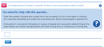
 If the instructions are not sufficient, help is provided in a question mark button next to each question. Although this is good practice, the button did not behave in a way I expected. When you select a button the page refreshes and takes you back to the top of the page. This is confusing and frustrating. Additionally, the help appears between the question and the field to answer (see image below). Normally when such a button is used a pop-up box opens or some text appears near the question without refreshing the page. As a result, my previous answer to another question was cleared so that when I tried to proceed, an error was returned. Although the error reporting was clear, it seemed unnecessary to clear previous answers and caused some annoyance.
 Another thing that was missing was a progress bar. Completing a census is quite a long process with lots of questions. At one point when my enthusiasm was beginning to wean, I searched for a progress bar to provide me with some encouragement. In this situation it would have been really useful to have some idea how far I was through the form and how much longer it might take.
Lastly, I was disappointed to find how much paper was wasted sending me a physical copy of the census when I knew I would complete it online. The paper census form cannot be reused by anyone else and must therefore be recycled. It seems that there could be a better system which would save the expense of creating surplus paper versions. Currently those who want to vote by post can do so by opting into this system. Perhaps a similar system could be adopted here whereby those who want to participate online do so by writing/calling or emailing the relevant person. Receiving a short code requires much less, if any paper.
Overall, it is great to see that the Government wants to get this right in advance of the real event. I hope the feedback which I was able to provide at the end of the form will go some way to ensuring any small issues are resolved. I know that the exercise will prove very valuable.
No comments:
Post a Comment