Friday, 1 May 2009
A new home
The User Vision blog has now moved to http://www.uservisionblog.co.uk. Please update your bookmarks and we look forward to welcoming you there.
Friday, 3 April 2009
Primed For Success
 Firstly, I would like to say that I have had a long and almost always successful relationship with Amazon. However, we are all used to ‘hidden’ costs associated with too good to be true deals. This is part of the everyday online purchase process and something which is becoming more and more prevalent. After a recent £30+ purchase, imagine my delight at being offered Free ‘Prime’ delivery on future purchases: ‘Congratulations you have qualified for our Free Amazon Prime™ service’. Hold me back!
 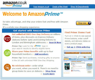 Although this might be one of those ‘too good to be true’ offers, I trusted Amazon and duly ordered a CD with prime delivery. Unfortunately, the postcode coverage did not extend to my location within the Scottish central belt so it was not possible to take advantage of this service. Six weeks later my account showed that I had been charged £47.97 for my annual Prime membership. My confusion was two-fold, why has this happened and also why does the site show 2 different annual fees?
  To ensure a balanced discussion Amazon did refund the £47.97 within 2 working days thanks to a helpful CSR I spoke to on the telephone. They also sent an email in advance of the refund to reassure me that the refund would happen. This is potentially a very useful service to serial Amazon users (which is also extended to family members) living in, what is defined as, accessible parts of the UK. However, providing this information upfront with clearly specified customer benefits and a consistent price point would assist in the uptake of this service. It would also ensure that customer satisfaction is not compromised.
Labels:
Amazon,
Customer Service,
e-commerce,
user experience
Tuesday, 31 March 2009
Testing the online census with users proves useful
Last year I blogged about the announcement that The General Register Office is planning to provide an online version of the 2011 census. In the blog I stressed the importance of testing the form to ensure that nothing prevents participants from completing it successfully. So when I received a leaflet stating that our household would be taking part in a 'trial run' I was very pleased. A few days later I was presented with my own census form. Sunday the 29th March (or thereafter) was the day everyone was being instructed to complete and return the form.
As the online version was something which appealed to me I was excited to get the opportunity to help test it out. I can report that on the whole my experience was a positive one. After entering your personal census code into the site, you are immediately taken to the form. Sections are separated onto a different pages with clear navigation buttons back and forth. The number of questions to each page is always minimal which saves scrolling. Clear instructions are also provided at necessary points.
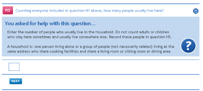
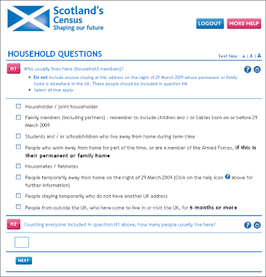 If the instructions are not sufficient, help is provided in a question mark button next to each question. Although this is good practice, the button did not behave in a way I expected. When you select a button the page refreshes and takes you back to the top of the page. This is confusing and frustrating. Additionally, the help appears between the question and the field to answer (see image below). Normally when such a button is used a pop-up box opens or some text appears near the question without refreshing the page. As a result, my previous answer to another question was cleared so that when I tried to proceed, an error was returned. Although the error reporting was clear, it seemed unnecessary to clear previous answers and caused some annoyance.
 Another thing that was missing was a progress bar. Completing a census is quite a long process with lots of questions. At one point when my enthusiasm was beginning to wean, I searched for a progress bar to provide me with some encouragement. In this situation it would have been really useful to have some idea how far I was through the form and how much longer it might take.
Lastly, I was disappointed to find how much paper was wasted sending me a physical copy of the census when I knew I would complete it online. The paper census form cannot be reused by anyone else and must therefore be recycled. It seems that there could be a better system which would save the expense of creating surplus paper versions. Currently those who want to vote by post can do so by opting into this system. Perhaps a similar system could be adopted here whereby those who want to participate online do so by writing/calling or emailing the relevant person. Receiving a short code requires much less, if any paper.
Overall, it is great to see that the Government wants to get this right in advance of the real event. I hope the feedback which I was able to provide at the end of the form will go some way to ensuring any small issues are resolved. I know that the exercise will prove very valuable.
As the online version was something which appealed to me I was excited to get the opportunity to help test it out. I can report that on the whole my experience was a positive one. After entering your personal census code into the site, you are immediately taken to the form. Sections are separated onto a different pages with clear navigation buttons back and forth. The number of questions to each page is always minimal which saves scrolling. Clear instructions are also provided at necessary points.
 If the instructions are not sufficient, help is provided in a question mark button next to each question. Although this is good practice, the button did not behave in a way I expected. When you select a button the page refreshes and takes you back to the top of the page. This is confusing and frustrating. Additionally, the help appears between the question and the field to answer (see image below). Normally when such a button is used a pop-up box opens or some text appears near the question without refreshing the page. As a result, my previous answer to another question was cleared so that when I tried to proceed, an error was returned. Although the error reporting was clear, it seemed unnecessary to clear previous answers and caused some annoyance.
 Another thing that was missing was a progress bar. Completing a census is quite a long process with lots of questions. At one point when my enthusiasm was beginning to wean, I searched for a progress bar to provide me with some encouragement. In this situation it would have been really useful to have some idea how far I was through the form and how much longer it might take.
Lastly, I was disappointed to find how much paper was wasted sending me a physical copy of the census when I knew I would complete it online. The paper census form cannot be reused by anyone else and must therefore be recycled. It seems that there could be a better system which would save the expense of creating surplus paper versions. Currently those who want to vote by post can do so by opting into this system. Perhaps a similar system could be adopted here whereby those who want to participate online do so by writing/calling or emailing the relevant person. Receiving a short code requires much less, if any paper.
Overall, it is great to see that the Government wants to get this right in advance of the real event. I hope the feedback which I was able to provide at the end of the form will go some way to ensuring any small issues are resolved. I know that the exercise will prove very valuable.
Monday, 23 March 2009
Amazon - supporting the user experience post sales
What started off as a really useful tool for both Amazon and their customers, has in my opinion, turned into a user experience nightmare. I am talking about the overwhleming array of options presented once you select a product - customer reviews, ratings, tags, what other people bought, frequently bought together, sponsored links, etc - and somewhere amongst it all are the product details.
As part of my new years health kick (already going badly) I decided to look into buying a juicer. Having honed it down to one product, I found the technical details were unhelpfully separated from the product details and then again from the product description, casuing much scrolling and hunting around the page for the info I needed. All the cross selling information totally disrupts the user journey and causes inefficient navigation which I don't find helps me. It has the opposite effect of getting in the way and annoying me. Ratings/feedback from other customers are helpful, but splitting up important information that I need upfront creates a disjointed experience which puts me off purchasing.
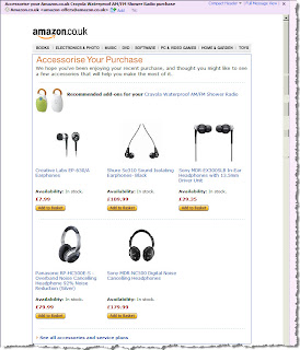
However, today I am pleased to find that Amazon have employed a useful means of cross selling and overcoming the current complexity of their site. I received an email around 3 weeks after I made a purchase from them, which provided a simple digest of other accessories I may find useful to add onto my purchase. Given I've had a few weeks to get used to the product, the timing works well. It also cuts through all the different presentation styles for ranking and rating accessories, and just gives me the information straight.
If only Amazon could apply the same approach to their online store and simplify the user experience keeping things straightforward and uncluttered. Maybe I would buy that juicer and finally start my long overdue health drive!
Tuesday, 10 March 2009
5 Features of a Public Sector Feedback System
The Government today unveiled new measures to bring greater transparency to public services. As reported on the BBC news today, a new NHS website will allow patients to comment on their local services and rate their GPs, similar to e-commerce sites such as Amazon and eBay. Providing transparency to local services such as these will be welcomed by those people who use the services. However, it also raises questions of how such as system might be implemented to make it easy to use and ensure it provides value to the public. After looking at the systems used by retailers I've created a list below which outlines features that can be incorporated into a similar system for public sector websites.
- Ensure that users can locate the review form quickly and easily. In e-commerce sites, invites to review products are placed next to the product details page. For public services this could happen next to the GPs name, for example. Calls to action should be clear with links which stand out from other text.
- Provide a rating system which visitors can review at a glance. Amazon has been using a 5 star rating which has quickly become standard across many other e-commerce sites. Although this system can be somewhat crude, when used in association with a full review it can provide visitors with an overview of these comments, a rating breakdown and statistical averages. This makes it easier for users to identify the review they wish to read in detail which is often a problem when there are a large number to navigate through.

- Do not ask visitors to register to leave a comment. This can actively discourage users to leave feedback. If the information they might have provided would have been valuable to someone else then this is an issue. Typically feedback forms ask users to leave a "name" and an email address which is not published. As anonymity is important to some people, especially if the feedback is contentious, users should feel confident about leaving a comment. It also reassures users that their personal details will not be used for marketing purposes.
- Provide guidelines to those thinking of leaving feedback. This can avoid situations where comments are removed because they are abusive or include personal details. As well as outlining what users should not do, it can also be a good opportunity to suggest what users can write. Debenhams have provided a link to their customer service department for those who have serious or complicated complaints which may be better dealt with privately. This prevents negative messages from being left prematurely and shows customers that they are serious about customer service and satisfaction.

- Welcome bad reviews as well as good reviews. Although there may be a fear that negative reviews can attract bad publicity and discourage public use of certain services, ultimately allowing negative reviews will increase user confidence in the system. As the Government's goal is to increase transparency, censoring negative reviews would defeat the purpose of such a system and in the long term reviews would be used less and lose value. If users adhere to the guidelines outlined in point four, there should be no need to remove reviews unnecessarily.
Labels:
Amazon,
Customer Service,
e-commerce,
Feedback forms
Monday, 2 March 2009
Compulsory field indicators?
After having vented my frustration about opting out of marketing programs on a previous blog, I couldn't let my recent discovery pass without commenting.
On an online form, the most common practice for a required field is to use an asterix (*). This lets us know which fields are compulsory to complete. People are now familiar with this.
I recently recieved a feedback form from Crystal Ski holidays. On this, they have an asterix (*) next to various fields. Going by common practice, I would have thought, without looking at the key, that these fields are compulsory.
But no! The key (which is at the bottom of the form rather than the top) states '*Please provide if you agree to be contacted for marketing and research by us and other selected third parties.' See image below...

By completing what I thought were compulsory fields, I would have signed up to their marketing program, which is certainly not my intention.
So...
On an online form, the most common practice for a required field is to use an asterix (*). This lets us know which fields are compulsory to complete. People are now familiar with this.
I recently recieved a feedback form from Crystal Ski holidays. On this, they have an asterix (*) next to various fields. Going by common practice, I would have thought, without looking at the key, that these fields are compulsory.
But no! The key (which is at the bottom of the form rather than the top) states '*Please provide if you agree to be contacted for marketing and research by us and other selected third parties.' See image below...

By completing what I thought were compulsory fields, I would have signed up to their marketing program, which is certainly not my intention.
So...
- Allow customers to opt-in rather than opt-out of marketing programs.
- Follow existing convention and to not try to trick the customer.
- Don't use people’s familiarity of required field indicators to get them to sign up for email marketing without realising it.
- Always put the text describing the indicator at the top of the fields. It is a piece of information the user needs to know before completing the forms, not after they think they’ve finished their task.
Friday, 20 February 2009
Grand Usability Designs
When watching Grand Designs recently, Kevin McCloud was talking about the usability of a staircase. It’s a sad and/or strange admission, but this caught my attention; Usability should be considered with physical objects, not just websites.
My heating system is an object, it’s inactive, but I interact with it and form a relationship with it. Whether it’s love or hate, it’s a relationship. The more positive a relationship I have, the more likely I am to interact with it without even thinking about it. I’m more likely to go back to it. How do I have a positive relationship with it? If it’s easy for me to use.
I’m pretty sure anyone reading this has had some kind of negative experience when trying to use a physical object. If not, where are you living?
It’s the same with paper. Have you ever opened a letter and not understood what it’s asking you to do? Have you sat puzzling over a form, not sure what the questions are asking, or which bits you should fill in. Have you managed to get confused when trying match up the instructions and the materials provided with flat-packed furniture?
The natural reaction as human beings is to start to question ourselves – is it me? Did I read the instructions properly? What am I doing wrong?
Past projects have seen us working with heating systems, mobile phones, remote controls, child car seats, ballot papers as well as websites. None of us here are technicians, electricians, designers or political experts, but we watch people, study their behavior, and see when they are struggling to understand how to complete the task in hand. We make recommendations on ‘how to make it easy’ based on what we see, and our experience and knowledge.
So whether it’s a website or any physical object, make your users happy and have positive relationships & experiences with your products. How? By making it easy to use!
Labels:
design,
forms,
internet,
Mobile phone usability,
Usability,
Usability Testing
Wednesday, 11 February 2009
Opting out of marketing programs
I was recently looking at comparison websites, and was amazed at how they get potential customers to overlook the ability to opt-out of marketing programmes.
Money Supermarket had a pre-checked check box as default on their form which I then had to un-check to opt-out.
The pre-checked check box certainly isn’t ideal, but it’s better than hiding options.
In order to opt out of Compare the Market’s marketing material, the opt-out area is located in the Terms &Condition’s (T&C). Who reads the T&C? When I accessed the T&C’s, I had to then tick the box to opt-out as the default was to receive information.
Go Compare dealt with this in a very interesting way that I’d not seen before. This time, instead of the check box, it said ‘If you'd prefer not to use this service, please click here’, so there was no check box visible on the page - See image below:

Aside from the fact the link text said 'please click here', once you clicked the link, the section revealed a previously hidden extension with a checkbox for me to tick if I wanted to opt-out of receiving marketing material. Only if you spot the textual link, read the small print, click on it, do you then get the option to opt-out – it’s pre-set for you to receive marketing information.

Surely these examples have the opposite effect that the company wants to happen. Customers will sign up unknowingly, and as a result receive calls/emails from insurance companies. Customers often use websites and in particular comparison sites because they want self service quotes and avoid inconvenient phone calls. Disguising privacy options and opting customers into sharing their details automatically with others will have a damaging impact on the relationship between the company and customer.
Evidence presented here clearly shows that best practices are required whenever customers provide personal information:
Money Supermarket had a pre-checked check box as default on their form which I then had to un-check to opt-out.
The pre-checked check box certainly isn’t ideal, but it’s better than hiding options.
In order to opt out of Compare the Market’s marketing material, the opt-out area is located in the Terms &Condition’s (T&C). Who reads the T&C? When I accessed the T&C’s, I had to then tick the box to opt-out as the default was to receive information.
Go Compare dealt with this in a very interesting way that I’d not seen before. This time, instead of the check box, it said ‘If you'd prefer not to use this service, please click here’, so there was no check box visible on the page - See image below:

Aside from the fact the link text said 'please click here', once you clicked the link, the section revealed a previously hidden extension with a checkbox for me to tick if I wanted to opt-out of receiving marketing material. Only if you spot the textual link, read the small print, click on it, do you then get the option to opt-out – it’s pre-set for you to receive marketing information.

Surely these examples have the opposite effect that the company wants to happen. Customers will sign up unknowingly, and as a result receive calls/emails from insurance companies. Customers often use websites and in particular comparison sites because they want self service quotes and avoid inconvenient phone calls. Disguising privacy options and opting customers into sharing their details automatically with others will have a damaging impact on the relationship between the company and customer.
Evidence presented here clearly shows that best practices are required whenever customers provide personal information:
- Don’t have the check box pre-checked. Allow customers to opt-in rather than opt-out.
- Don’t hide the check box in the T&C’s.
- Display the check box to opt out initially, that’s what customers will scan for.
- If the page refreshes due to an error, make sure once the customer has chosen to opt-in or out, their choice remains fixed: they should not have to input their choice again.
Sunday, 1 February 2009
Good Vibrations via my mobile
For the past week I have been in that rapture of getting a new phone and enjoying all the new features and improvements from my previous one. After a long flirtation with the iPhone, I finally committed myself to the HTC Touch HD, and I have no regrets.
I have actually been using the HTC products for my past 3 phones, although branded as the Orange SPV range, before HTC had the brand confidence to lose the alias. Among the many features (like the iPhone, it lets you flick things around the display, and also has great photo image quality and connection speeds) one of my favourite is not something I see or hear but rather feel.
The HTC Touch is the first phone I have that uses vibrations for more than letting me know when calls or messages are incoming when I am in a movie or meeting where a ring would be a nuisance. The phone uses haptic feedback via a short vibration or bump to let me know when little things have happened such as:
Its a tiny feature but I am surprised at how much it adds to my overall experience and enjoyment of the phone.
I recall doing some experiments in haptics, the sense of touch and psychophysics way back in my university days but this is the first product I have had that has elegantly integrated it into the usage (aside from the Wii on the gaming front). Thinking back to my previous phone I realise that often when I made a call I had to alternate between holding the phone to my ear and looking at the display to see if it had been answered, particularly in a noisy environment like a gig or a bar. A minor issue in the grand scheme of things, but still one that is better off solved through a gentle vibration.
No doubt haptics will be integrated into more things and, used wisely, should be a positive contribution to mobile phone and consumer product usability. I certainly am looking forward to it as products make best use of all of our senses.
I have actually been using the HTC products for my past 3 phones, although branded as the Orange SPV range, before HTC had the brand confidence to lose the alias. Among the many features (like the iPhone, it lets you flick things around the display, and also has great photo image quality and connection speeds) one of my favourite is not something I see or hear but rather feel.
The HTC Touch is the first phone I have that uses vibrations for more than letting me know when calls or messages are incoming when I am in a movie or meeting where a ring would be a nuisance. The phone uses haptic feedback via a short vibration or bump to let me know when little things have happened such as:
- my call has been answered
- moving to a new web page
- closing an application
- the little ball in the 'Teeter' game is bumping into a wall (see video of it being demonstrated on the HTC Diamond)
Its a tiny feature but I am surprised at how much it adds to my overall experience and enjoyment of the phone.
I recall doing some experiments in haptics, the sense of touch and psychophysics way back in my university days but this is the first product I have had that has elegantly integrated it into the usage (aside from the Wii on the gaming front). Thinking back to my previous phone I realise that often when I made a call I had to alternate between holding the phone to my ear and looking at the display to see if it had been answered, particularly in a noisy environment like a gig or a bar. A minor issue in the grand scheme of things, but still one that is better off solved through a gentle vibration.
No doubt haptics will be integrated into more things and, used wisely, should be a positive contribution to mobile phone and consumer product usability. I certainly am looking forward to it as products make best use of all of our senses.
Labels:
haptic technology,
iphone,
Mobile phone usability
Communicating across web accessibility barriers
Recently I had the opportunity to communicate across several barriers and technologies in a fascinating demonstration of how people and technology can be combined to overcome accessibility challenges.
After speaking at the Andicom Conference in Cartegena Colombia, I attended the commercial exhibition and particularly the U-city, a demonstration of ubiquitous computing in various areas of everyday life.
As User Vision provide many web accessibility services such as usability testing with disabled users and accessibility audits, I spent quite a bit of time with the project Conectando Sentidos (Connecting Senses) the Colombian Ministry of Communication’s programme addressing accessibility in technology.
There, in addition to seeing their demonstrations of magnifiers and refreshable Braille displays (photos below), I met for the first time a person who was both deaf and blind. I have long wondered how people without either hearing or sight can communicate, especially using today’s technologies.
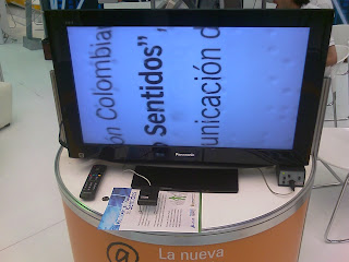

The team set about demonstrating by having me engage in a conversation across several potential barriers, as shown in the photos:
After speaking at the Andicom Conference in Cartegena Colombia, I attended the commercial exhibition and particularly the U-city, a demonstration of ubiquitous computing in various areas of everyday life.
As User Vision provide many web accessibility services such as usability testing with disabled users and accessibility audits, I spent quite a bit of time with the project Conectando Sentidos (Connecting Senses) the Colombian Ministry of Communication’s programme addressing accessibility in technology.
There, in addition to seeing their demonstrations of magnifiers and refreshable Braille displays (photos below), I met for the first time a person who was both deaf and blind. I have long wondered how people without either hearing or sight can communicate, especially using today’s technologies.


The team set about demonstrating by having me engage in a conversation across several potential barriers, as shown in the photos:

- What I said in English was first translated to Spanish by one team member
- Another person communicated the message to Juan, the deaf & blind person by holding their hands & arms and manoeuvring them in a way to convey the message in a form of physical sign language
- Once he understood the message Juan used sign language to communicate to another person via a web cam and web connection
- The person at the other end of the web cam replied, their response was translated by movement again to Juan, and the process continued.
The demonstration was a fascinating display of overcoming barriers through innovation and technology, and for me a great insight to how communication is achieved with people who are both deaf and blind.
Thursday, 29 January 2009
Accessibility - More than just checking the boxes
With the new WCAG 2.0 guidelines in full flow, I find myself presenting a number of introductory courses to clients, analysing the new guidelines in some detail.
At the beginning of each course though, I always stress that whilst the course itself is all about the guidelines, the same can't always be said of Accessibility. Time and time again when testing with disabled users, the real issues, the real bona-fide, "can't go any further" barriers are not necessarily attributable to violations of the guidelines themselves. Meeting guidelines and making your site accessible doesn't always go hand in hand, nor should it.
I'm not suggesting we ignore the guidelines. Of course we should adhere to them. What I am saying is that we shouldn't view the guidelines in isolation. By all means, audit against the guidelines but if you want the real insight, straight from the horses mouth so to speak, then you should really test your site with disabled users.
As a general rule, disabled users encounter more issues than able-bodied users. Not only do they experience the same usability issues but they also have an additional layer of difficulty on top, whether that difficulty is caused directly as a result of their disability or by badly marked up pages, poorly presented content or inadequate assistive technology.
As designers, developers (and occassionaly even as accessibility specialists) we often make assumptions about the types of difficulties users with disabilities will encounter. I never fail to be surprised during disabled testing when a user fails to fall over what looked like a glaring hurdle. Conversely, I am also never surprised when a developer tells me that their site is fully accessible only to find that it is almost unusable for users with particular disabilities.
The key thing to bear in mind is that technically accessible is not always accessible in practice. Building a fully accessible form - labels, logical tab order, properly titled buttons, optimised error messages - is one thing. However, if you give this form 40 fields then at the very least it is laborious to navigate for keyboard and screen reader users. For users with a severe physical disability, entering information into 40 fields may become virtually impossible.
The guidelines stipulate that we must provide text equivalents for non-text content. Again, this should be easy enough to achieve. Do this incorrectly however and the constant reading out of over-elaborate and unnecessary alternative text may result in blind users giving up and potentially using a competitors site which doesn't suffer from additional "noise".
Still on the subject of blind users, many navigate using the 'links list' in JAWS or the equivalent in Hal or Window Eyes. Clearly naming your hyperlinks is a requirement of the WCAG guidelines but there is a world of difference between clearly naming then and sensibly naming them. Many a time I have witnessed a blind user looking for contact detail access the links list and press 'C'. After all, pressing 'C' to jump to 'contact us' would make sense, right?
Of course it does. Except if the link to your contact page is labelled 'Talk to us' or 'Get in touch' that is. When pressing 'C' doesn't bring up the required link, it's guesswork time and the blind user ends up pressing random keys or (as is usually the case) listening through all of the links until something sounds right. Testing with disabled users gives us this critical insight into not only which tools are available to them, but exactly how they use them in their day to day interactions with the web.
These examples are only a handful of many similar experiences, gathered from hours of testing with disabled users. Any one of these issues taken in isolation should be enough to highlight the merits of disabled testing. The fact of the matter is that any project where disabled testing takes place regularly highlights numerous accessibility barriers either of the same severity or of a greater severity than those detailed above.
And no amount of 'box checking' is going to solve them.
Wednesday, 21 January 2009
Navigation methods in mobile web usability
During my experience testing mobile websites, it has become apparent that users are split on their preferred navigation style. I have come to realise that this is a complex issue to resolve. Normally as a usability consultant, consistency is something which I regularly find myself recommending to clients. While the same principle applies in mobile sites, it may be better to alter the design according to the type of handset the user owns and keep the style consistent throughout their experience.
The split related to the type of navigation style used and how well each method worked: a traditional search form or a 'drill-down' type of navigation. The 'drill-down' method allows the user to search for something by selecting a series of options or answering a number of questions, similar to a decision tree.
Using a search form is the ideal solution for some. It is common on the web and therefore familiar to users across multiple platforms. It also gives them a sense of control. Most importantly users perceive a search form to be the quickest route to a set of results. This is most attractive as users always want to find information in the quickest way possible.
However, search forms were originally designed for the web and not for mobile browsing. Not all mobile phones have full keyboards therefore typing on a mobile phone is not as easy or convenient. It is made even more difficult when trying to type on the move or with one hand, for example, the URL may use characters not commonly used during day to day texting. Also, someone commuting to work by bus/train for example is less liked to have both hands free. In this situation, a system which allows someone to navigate with one finger would be easier to use.
So which navigation works best? The answer is both but is dependent on the type of handset being used and maybe even the users' experience with that device. Sophisticated mobiles such as the iPhone can cope much better with traditional websites. Older phones or phones with small screens cannot manage full scale pages as well and this forces the user to scroll horizontally. While Blackberry's and other PDA's have more keyboard functionality, many have to contend with a limited number of buttons.
In a situation like this, longitudinal diary style studies would provide valuable feedback from users who experience the mobile web in real life situations. The findings would go some way to resolving the split between searching traditionally and drilling down through a site. It would also help to determine which mobiles work best for each navigational style.
Labels:
design,
diary study,
iphone,
Mobile phone usability,
user research
Subscribe to:
Comments (Atom)

